Iterating to a Better Visualization
A few months ago I was presented with a visualization at work by a colleague who was very excited about it. They were adamant that I add it to the analytics package I was working on. I thought there were several problems with the visualization. In this post, I recount the iterations I went through to create what I think is a better visualization.
Where It All Began
All of the visualizations are trying to communicate the trade offs between two alternative set of projected cash flows. One, the baseline, is the set of cash flows which will occur if the client continues with their current policy unchanged. The alternative is the set of cash flows which is projected to occur if the client implements a new policy.
In the d_raw table, the delta column is the difference in the aggregate annual cash flows for the alternative policy and the baseline policy. I’m starting with the differences because that was the only data I had in the original visualization. The data below are not the same as the original but are analogous.
suppressPackageStartupMessages({
        library(tidyverse)
        library(glue)
        library(gt)
        })

d_raw <- tribble(
  ~py, ~delta,
  2018,  -248,
  2019,  -193,
  2020,  -121,
  2021,   -53,
  2022,   -19,
  2023,    75,
  2024,   222,
  2025,   310,
  2026,   425
)

d <- mutate(d_raw,
            scenario = as.factor(case_when(delta > 0 ~ "alternative",
                                           TRUE ~ "baseline")),
            label = glue("${abs(delta)}")
)
gt(d)| py | delta | scenario | label |
|---|---|---|---|
| 2018 | -248 | baseline | $248 |
| 2019 | -193 | baseline | $193 |
| 2020 | -121 | baseline | $121 |
| 2021 | -53 | baseline | $53 |
| 2022 | -19 | baseline | $19 |
| 2023 | 75 | alternative | $75 |
| 2024 | 222 | alternative | $222 |
| 2025 | 310 | alternative | $310 |
| 2026 | 425 | alternative | $425 |
ggplot(d, aes(x = py)) +
        geom_point(aes(y = 1, size = abs(delta), color = scenario)) +
        scale_size(range = c(5, 22)) +
        geom_text(aes(y = 1, label = label)) +
        scale_color_manual(values = c("#8EE5EE", "#AB82FF")) +
        geom_vline(xintercept = c(2022 + 2/3, 2025 + 2/3),
                   linetype = "dashed") +
        geom_label(aes(x = 2022, y = 1.45, label = "Breakeven 68\nmonths")) +
        geom_label(aes(x = 2024.9, y = 1.45,
                       label = "Realized gains\nbegin month 104")) +
        geom_segment(aes(x = 2017.5, xend = 2022.5, y = 1.2, yend = 1.2),
                     color = "blue") +
        geom_text(aes(x = 2020, y = 1.27),
                  label = paste0("$647k in capital invesment in the first\n",
                                 "68  months needed to generate returns")) +
        scale_x_continuous(breaks = 2018:2026, name = "projection year") +
        scale_y_continuous(limits = c(0.5, 1.5)) +
        ggtitle("Projection of Future Cost: Baseline vs Alternative",
                paste0("Annual difference in cost between ",
                       "baseline scenario and alternative scenario")) +
        theme_classic() +
        guides(size = FALSE) +
        theme(legend.position = "bottom",
              axis.title.y = element_blank(),
              axis.text.y = element_blank())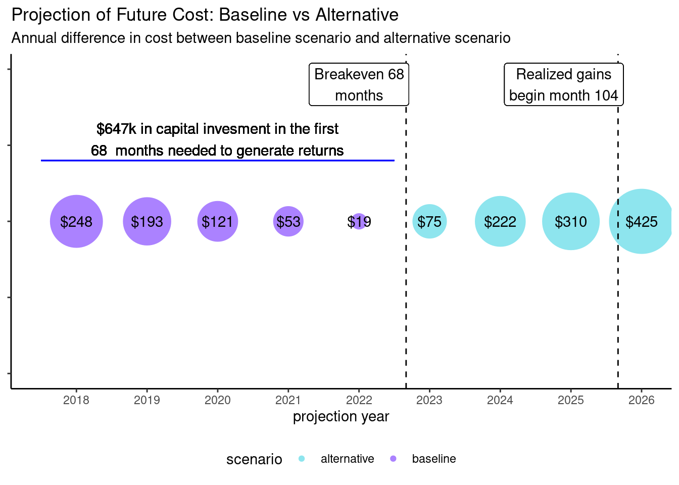
The color indicates which scenario is the lowest cost scenario for a particular year. The magnitudes of the difference between the two cash flows is represented by the size of the bubble; negative values imply alternative scenario is more expensive. It is also used as the label at the center of each bubble. Two important points are called out on the annotation of the plot: the break even month (68) and the month where the cumulative cash flow differences becomes positive (104), that is when the the cumulative cash flows of the baseline policy exceed those of the alternative policy.
Why I think this visualization is not effective
When I first saw this visualization, it was not clear to me what information it was trying to make it easier for me to understand. A good data visualization should reduce the mental load of the viewer to gain understanding. I was eventually able to decipher what it was trying to communicate after looking at it for a while and reading the accompanying explanatory notes.
Two more specific issues with the visualization are the use of bubbles and the choice of colors. The area of the bubbles is used to convey the relative sizes in the cash flow differences. However, it is harder for humans to reason about relative areas (2d) than relative lengths (1d). The visualization unnecessarily projects one-dimensional data into two dimensions. For example, I know, because of the value labels, that the bubble for year 2025 is about 50% larger than the bubble for 2024, but I would not have guessed it from the size of the bubble.
The color used in the visualization conveys important information. It’s the only graphical element which tells the user the sign of the differences in the two sets of cash flows. As such, choosing colors that help the viewer understand the direction of the cash flows would probably be better than choosing colors which make it look pretty.
So what would be better
I’ve highlighted a few things I think are issues with the original visualization. Next, I will try to address these issues to create what I think is a better visualization. I’ve seen Tufte and others compare visualizations found in the “wild”, with their own improved versions. Perhaps they can go straight from A to B, but I typically need to iterate. I thought it might be interesting or helpful to record the steps I went through.
Iteration 1 - Bursting the Bubbles
So my first thought was to get rid of the bubbles and use a column chart. I also wanted to give some context to the months which are highlighted in the call outs so I added a second x-axis. Important to note, this secondary x-axis has exactly the same scale as the primary one.
ggplot(d, aes(py, delta, fill = scenario)) +
  geom_bar(stat = "identity", width = 0.3) +
  geom_hline(yintercept = 0) +
  scale_fill_manual(values = c("#8EE5EE", "#AB82FF")) +
  annotate("segment", x = 2017.5, xend = 2022.5,
           y = 100, yend = 100,
           color = "blue") +
  annotate("text", x = 2020, y = 175,
           label = paste0("$647k in capital invesment in the first\n",
                          "68  months needed to generate returns")) +
  annotate("text", x = 2024.5, y = -100,
           label = paste0("Cashflow breakeven at 68 momnths\n",
                          "Realize gain after 104 months")) +
  scale_x_continuous(breaks = 2018:2026, expand = c(0, 0),
                     sec.axis = sec_axis(~ 12*(. - 2017),
                                         name = "Months into Future",
                                         breaks = 12*(1:9))) +
  ggtitle("Projection of Future Cost: Baseline vs Alternative",
                paste0("Annual difference in cost between ",
                       "baseline scenario and alternative scenario")) +
  theme_classic() +
  theme(legend.position = "none")+
  ylab("Annual Cashflow Difference (in thousands)") + xlab("projection year")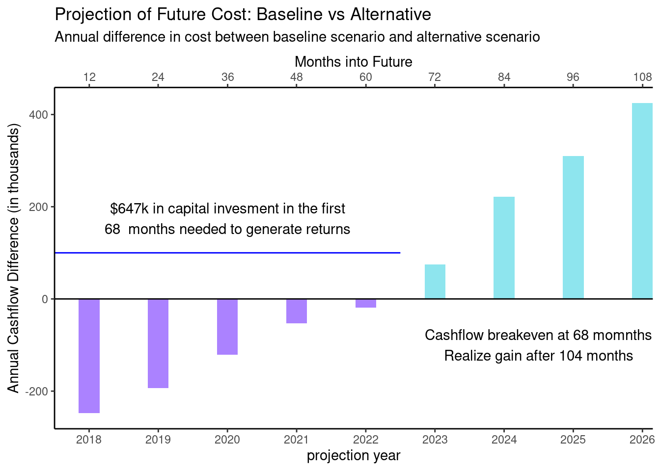
I think this already much better. It now immediately obvious that about half way between 60 and 72 months the sign changes from a negative delta to a positive one.
Iteration 2 - Clean up the Call Outs
Next, I thought it was sort of visually jarring to have the call out for the first half of the chart above the 0 line and the other below. I also thought it might be good to try to tie the call outs to the relate regions of the chart with color.
ggplot(d, aes(py, delta, fill = scenario)) +
  geom_bar(stat = "identity", width = 0.3) +
  scale_fill_manual(values = c("#8EE5EE", "#AB82FF")) +
  geom_hline(yintercept = 0) +
  annotate("segment", x = 2017.5, xend = 2022.5,
           y = 400, yend = 400,
           color = "#AB82FF") +
  annotate("text", x = 2020, y = 455,
           label = paste0("$647k in capital invesment in the first\n",
                          "68  months needed to generate returns")) +
  annotate("segment", x = 2022.5, xend = 2026.5,
           y = 400, yend = 400,
           color = "#8EE5EE") +
  annotate("text", x = 2024.5, y = 455,
           label = paste0("Cashflow breakeven at 68 momnths\n",
                          "Realize gain after 104 months") )+
  scale_x_continuous(breaks = 2018:2026, expand = c(0, 0),
                     sec.axis = sec_axis(~ 12*(. - 2017),
                                         name = "Months into Future",
                                         breaks = c(12*(1:9), 68, 104))) +
  scale_y_continuous(limits = c(-260, 475)) +
  ggtitle("Projection of Future Cost: Baseline vs Alternative",
                paste0("Annual difference in cost between ",
                       "baseline scenario and alternative scenario")) +
  theme_classic() +
  theme(legend.position = "none")+
  ylab("Annual Cashflow Difference (in thousands)") + xlab("projection year")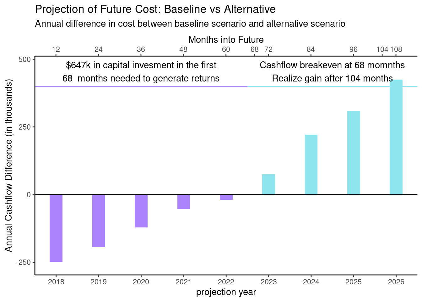
Iteration 3 - Concentrate on the Cumulative Cashflows
There are two “critical points” that are called out on the chart. 68 months is the point at which the difference between the cash flows of the two scenarios flips from negative to positive; 104 months is the point past which all of the positive differences in cash flows exceed all negative ones, but that is not something that can be seen in this version of the visualization. This led me to overlay the cumulative cash flows.
d_cumulative <- mutate(d, cumdelta = cumsum(delta), start = cumdelta - delta)

ggplot(d_cumulative, aes(x = py, fill = scenario)) +
    geom_col(aes(y = delta), width = 0.3) +
    scale_fill_manual(values = c("#8EE5EE", "#AB82FF")) +
    geom_point(aes(y = cumdelta)) +
        geom_line(aes(y = cumdelta), color = "black") +
    scale_x_continuous(breaks = 2018:2026, expand = c(0, 0),
                     sec.axis = sec_axis(~ 12*(. - 2017),
                                         name = "Months into Future",
                                         breaks = sort(c(12*(1:9), 68, 104)))) +
    scale_y_continuous(breaks = c(-647, -500, -250, 0, 250, 500)) +
    geom_hline(yintercept = 0) +
    theme_classic() +
  ggtitle("Projection of Future Cost: Baseline vs Alternative",
                paste0("Annual difference in cost between ",
                       "baseline scenario and alternative scenario")) +
  theme_classic() +
  theme(legend.position = "none")+
  ylab("Annual Cashflow Difference (in thousands)") + xlab("projection year")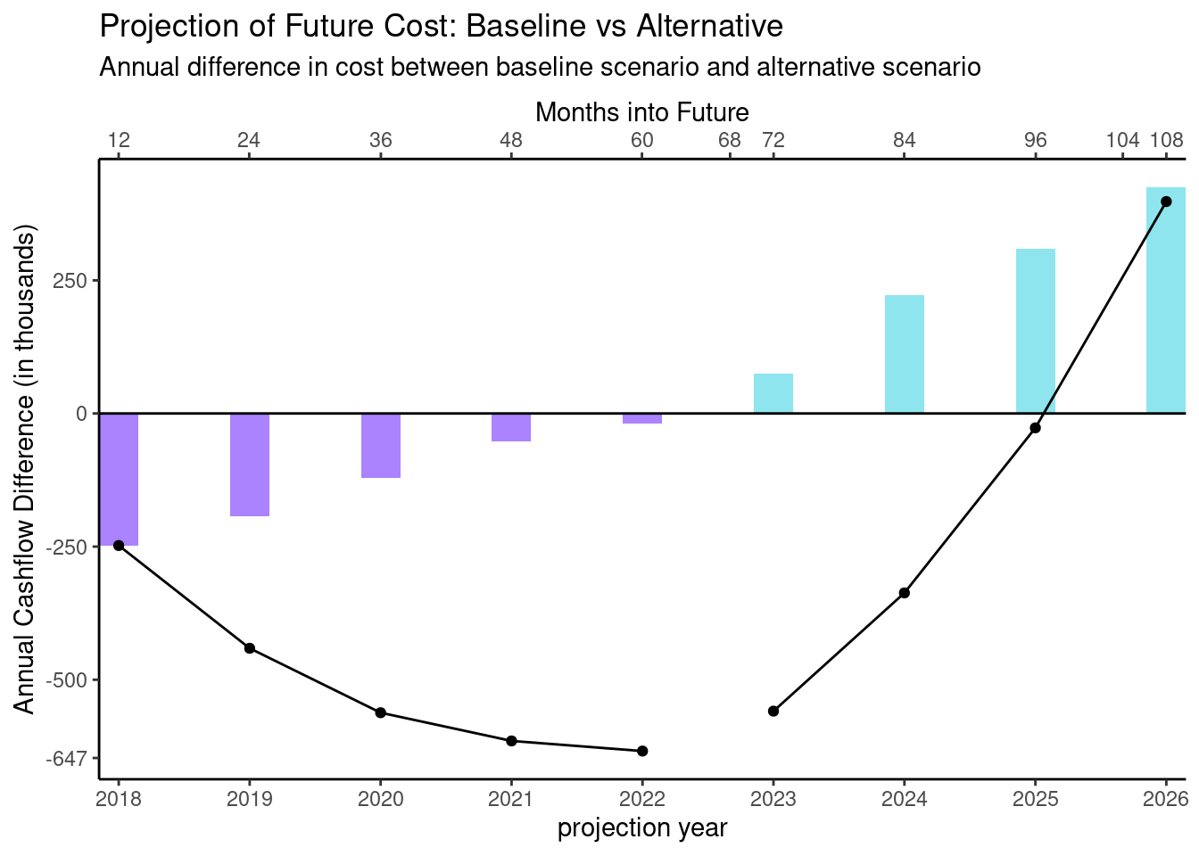
Okay, now we’re getting somewhere. Plotting the cumulative data removes the need for any call outs since we can see clearly the two critical points in the cumulative data. The inflection point, the part where the curve bottoms out is the point where the cash flows change from negative to positive. And the place where the cumulative plot crosses the x-axis is visually near 104 months.
Iteration 4 - What about a Waterfall?
I want to emphasize both the incremental changes and the cumulative values. I first attemptted to accomplish this by using a waterfall chart.
ggplot(d_cumulative) +
        geom_rect(aes(xmin = py - 0.2,
                  xmax = py + 0.2,
                  ymin = start,
                  ymax = cumdelta,
                  fill = scenario)) +
        scale_fill_manual(values = c("#8EE5EE", "#AB82FF")) +
        geom_hline(yintercept = 0) +
        geom_hline(yintercept = -647) +
        scale_x_continuous(breaks = 2018:2026, expand = c(0, 0),
                     sec.axis = sec_axis(~ 12*(. - 2017),
                                         name = "Months into Future",
                                         breaks = sort(c(12*(1:9), 68, 104)))) +
        scale_y_continuous(breaks = c(-647, -500, -250, 0, 250, 500)) +
        theme_classic() +
        theme(legend.position = "none") +
        ggtitle("Projection of Future Cost: Baseline vs Alternative",
                paste0("Annual difference in cost between ",
                       "baseline scenario and alternative scenario")) +
        ylab("Annual Cashflow Difference (in thousands)") +
        xlab("projection year")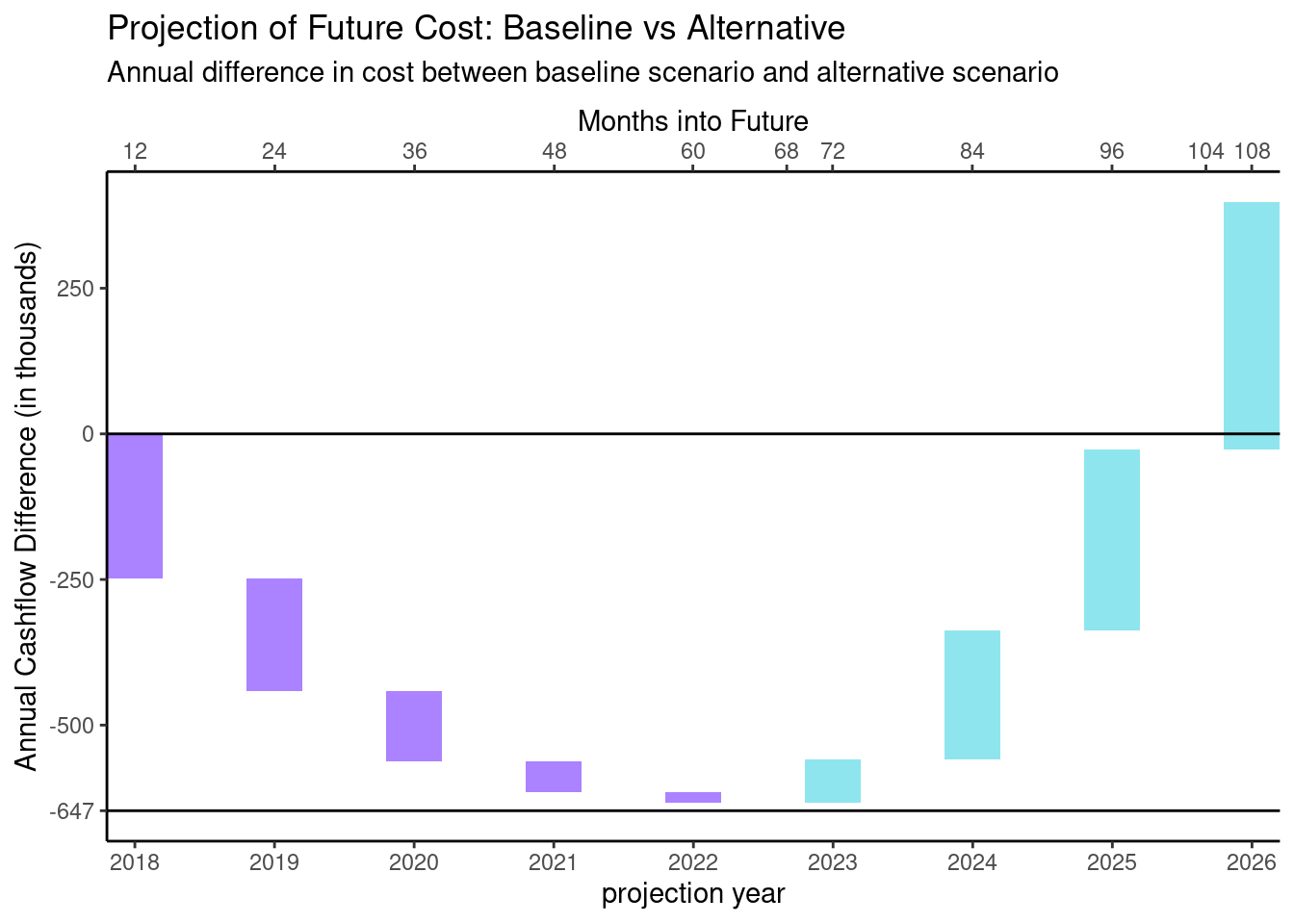
Now I can see how each incremental value accumulates to the cumulative value. The two “critical points” jump out of the plot. So there are three things now that bother me about this plot.
Although if I read the chart left to right, I can easily follow the incremental movements, I find it a little confusing to understand the direction the waterfall is moving if I start by looking at the middle of the plot.
I wonder if there is a way to make what’s happening here more “grok-able”. The values being plotted show the incremental and cumulative cost savings between the alternative scenario and the baseline scenario. Negative cost savings feels a little bit like a double negative.
Now that the main feature of the plot calls out both the inflection point and the point at which the cumulative savings become positive, it’s clear that the analysis was done using more granular data then what we’re showing. If we could plot quarterly cash flows we could see the two critical points exactly.
I don’t actually have the quarterly data, so I will try to address the first two points above using the annual data and then extrapolate the quarterly data.
Iteration 5 - Changing Direction and Color
I’m going to see if I can deal with the “grok-ableness” issue first. The baseline scenario is what will happen if the client continues their current policy; the alternative involves a change to that policy. I want to frame things in terms of costs and savings to the client relative to the baseline scenario. I’ll start by re-factoring the data slightly.
d_alt <- mutate(d_raw, delta = -delta) %>%
        rename(amt = delta) %>%
        mutate(direction = as.factor(case_when(amt >= 0 ~ "cost", TRUE ~ "savings")),
               cumamt = cumsum(amt),
               start = cumamt - amt)
gt(d_alt)| py | amt | direction | cumamt | start |
|---|---|---|---|---|
| 2018 | 248 | cost | 248 | 0 |
| 2019 | 193 | cost | 441 | 248 |
| 2020 | 121 | cost | 562 | 441 |
| 2021 | 53 | cost | 615 | 562 |
| 2022 | 19 | cost | 634 | 615 |
| 2023 | -75 | savings | 559 | 634 |
| 2024 | -222 | savings | 337 | 559 |
| 2025 | -310 | savings | 27 | 337 |
| 2026 | -425 | savings | -398 | 27 |
ggplot(d_alt) +
        geom_rect(aes(xmin = py - 0.2,
                  xmax = py + 0.2,
                  ymin = start,
                  ymax = cumamt,
                  fill = direction)) +
        scale_fill_manual(values = c("#FF6A6A", "#00CD66")) +
        geom_hline(yintercept = 0) +
        scale_x_continuous(breaks = 2018:2026, expand = c(0, 0),
                     sec.axis = sec_axis(~ 12*(. - 2017),
                                         name = "Months into Future",
                                         breaks = sort(c(12*(1:9), 68, 104)))) +
        scale_y_continuous(breaks = c(-500, -250, 0, 250, 500, 647)) +
        theme_classic() +
        theme(legend.position = "right", legend.justification = "top")+
        ylab("Additional Cost/(Savings) (in thousands)") +
        xlab("projection year") +
        ggtitle("Projection of Future Cost: Baseline vs Alternative",
                paste0("Additional Annual Cost/(Savings) from switching ",
"from the baseline to alternative scenario")) 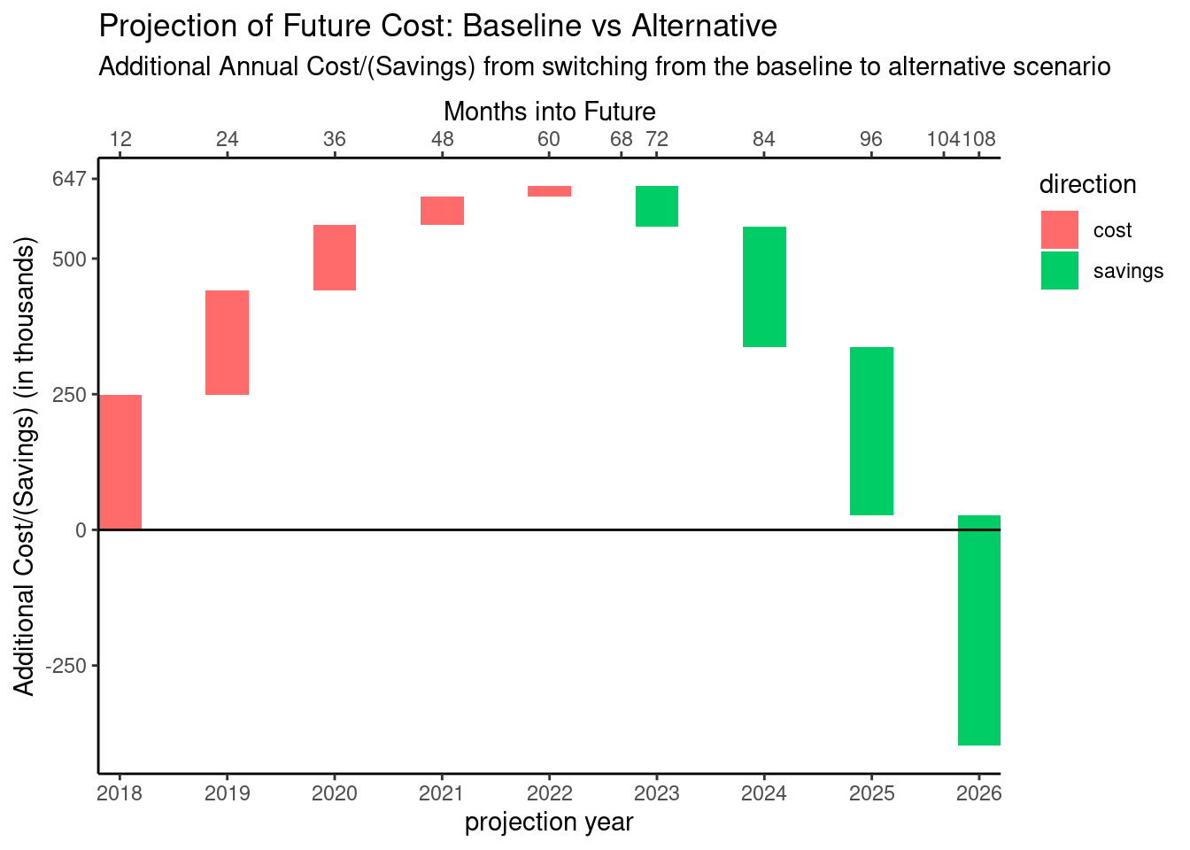
So now, I think this gels with my intuition, the direction, labels, and color all point in the same direction: increasing expense is an increase and is showing in red (bad); decreasing expense is a decrease and is showing green (good).
Iteration 6 - Clear Directions
The choice of colors which indicate direction is helpful, but it doesn’t completely address my concern with being able to easily see the direction of each incremental change.
One idea is to make the width of each column wider and add data labels.
ggplot(d_alt) +
        geom_rect(aes(xmin = py - 0.35,
                  xmax = py + 0.35,
                  ymin = start,
                  ymax = cumamt,
                  fill = direction)) +
        scale_fill_manual(values = c("#FF6A6A", "#00CD66")) +
        geom_text(aes(x = py, y = cumamt - sign(amt) * 25,
                      label = ifelse(abs(amt) < 50, "", amt))) +
        geom_hline(yintercept = 0) +
        scale_x_continuous(breaks = 2018:2026, expand = c(0, 0),
                     sec.axis = sec_axis(~ 12*(. - 2017),
                                         name = "Months into Future",
                                         breaks = sort(c(12*(1:9), 68, 104)))) +
        scale_y_continuous(breaks = c(-500, -250, 0, 250, 500, 647)) +
        theme_classic() +
        theme(legend.position = "right", legend.justification = "top") +
        ylab("Additional Cost/(Savings) (in thousands)") +
        xlab("projection year") +
        ggtitle("Projection of Future Cost: Baseline vs Alternative",
                paste0("Additional Annual Cost/(Savings) from switching ",
"from the baseline to alternative scenario")) 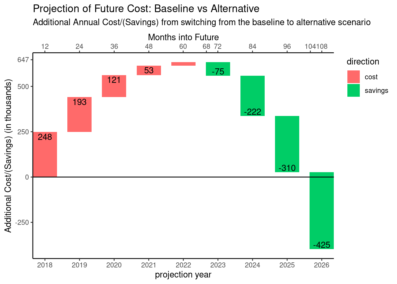
Another option would be to use something inherently directional like an arrow.
ggplot(d_alt) +
        geom_segment(aes(x = py,
                  xend = py,
                  y = start,
                  yend = cumamt,
                  color = direction),
                  arrow = arrow(length = unit(0.25, "cm"), type = "closed")) +
        scale_color_manual(values = c("#FF6A6A", "#00CD66")) +
        geom_text(aes(x = py - 0.28, y = (start + cumamt)/2,
                      label = ifelse(abs(amt) < 50, "", amt))) +
        geom_hline(yintercept = 0) +
        scale_x_continuous(breaks = 2018:2026,
                     sec.axis = sec_axis(~ 12*(. - 2017),
                                         name = "Months into Future",
                                         breaks = sort(c(12*(1:9), 68, 104)))) +
        scale_y_continuous(breaks = c(-500, -250, 0, 250, 500, 647)) +
        theme_classic() +
        theme(legend.position = "none") +
        ylab("Additional Cost/(Savings) (in thousands)") +
        xlab("projection year") +
        ggtitle("Projection of Future Cost: Baseline vs Alternative",
                paste0("Additional Annual Cost/(Savings) from switching ",
"from the baseline to alternative scenario")) 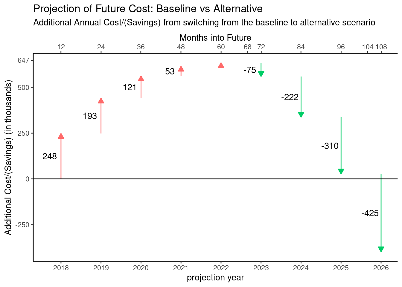
Okay, I like that even better than I thought I would. I don’t think the legend is necessary with this version.
Iteration 7 - Extrapolating the quarterly data
If we take a look at the annual cumulative data again, I think it’s clear we can get a pretty good fit with a quadratic or cubic fit.
d_model <- select(d_alt, py, cumamt) %>%
        mutate(py = py + 1) %>%
        bind_rows(tibble(py = 2018, cumamt = 0)) %>%
        arrange(py)

model <- lm( cumamt ~ poly(py, 3), data = d_model)

summary(model)
##
## Call:
## lm(formula = cumamt ~ poly(py, 3), data = d_model)
##
## Residuals:
## Min 1Q Median 3Q Max
## -23.014 -5.739 -1.398 6.976 21.779
##
## Coefficients:
## Estimate Std. Error t value Pr(>|t|)
## (Intercept) 302.500 4.722 64.061 9.73e-10 ***
## poly(py, 3)1 -310.417 14.933 -20.788 8.07e-07 ***
## poly(py, 3)2 -955.251 14.933 -63.971 9.81e-10 ***
## poly(py, 3)3 -109.221 14.933 -7.314 0.000333 ***
## ---
## Signif. codes: 0 '***' 0.001 '**' 0.01 '*' 0.05 '.' 0.1 ' ' 1
##
## Residual standard error: 14.93 on 6 degrees of freedom
## Multiple R-squared: 0.9987, Adjusted R-squared: 0.998
## F-statistic: 1526 on 3 and 6 DF, p-value: 4.903e-09predicted_data <- data.frame(py = 2018:2027) %>%
mutate(amt = predict(model, .))
ggplot(d_model, aes(x = py, y = cumamt)) +
geom_point() +
geom_line(aes(x = py, y = amt), data = predicted_data, color = "blue")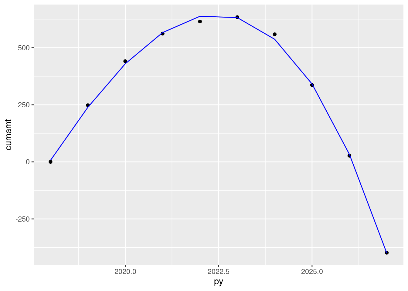
So I’ll now use this model to create simulated quarterly data.
years <- 2018:2026
num_years <- length(years)
d_qtr <- data.frame(py = c(rep(years, 4), 2027),
                    qtr = c(rep(0, num_years),
                            rep(0.25, num_years),
                            rep(0.5, num_years),
                            rep(0.75, num_years), 0)) %>%
        mutate(py = py + qtr) %>%
        select(py) %>%
        arrange(py) %>%
        mutate(cumamt = predict(model, .), month = 4 * row_number())

d_qtr$cumamt[1] <- 0
d_qtr <- mutate(d_qtr,
                amt = cumamt - lag(cumamt),
                direction = as.factor(case_when(amt >= 0 ~ "cost",
                                                TRUE ~ "savings")),
                start = cumamt - amt)

gt(d_qtr)| py | cumamt | month | amt | direction | start |
|---|---|---|---|---|---|
| 2018.00 | 0.00000 | 4 | NA | savings | NA |
| 2018.25 | 68.32398 | 8 | 68.323982 | cost | 0.00000 |
| 2018.50 | 127.63250 | 12 | 59.308521 | cost | 68.32398 |
| 2018.75 | 184.69237 | 16 | 57.059869 | cost | 127.63250 |
| 2019.00 | 239.31935 | 20 | 54.626976 | cost | 184.69237 |
| 2019.25 | 291.32919 | 24 | 52.009843 | cost | 239.31935 |
| 2019.50 | 340.53766 | 28 | 49.208470 | cost | 291.32919 |
| 2019.75 | 386.76052 | 32 | 46.222857 | cost | 340.53766 |
| 2020.00 | 429.81352 | 36 | 43.053003 | cost | 386.76052 |
| 2020.25 | 469.51243 | 40 | 39.698909 | cost | 429.81352 |
| 2020.50 | 505.67300 | 44 | 36.160575 | cost | 469.51243 |
| 2020.75 | 538.11100 | 48 | 32.438001 | cost | 505.67300 |
| 2021.00 | 566.64219 | 52 | 28.531186 | cost | 538.11100 |
| 2021.25 | 591.08232 | 56 | 24.440131 | cost | 566.64219 |
| 2021.50 | 611.24716 | 60 | 20.164836 | cost | 591.08232 |
| 2021.75 | 626.95246 | 64 | 15.705301 | cost | 611.24716 |
| 2022.00 | 638.01399 | 68 | 11.061526 | cost | 626.95246 |
| 2022.25 | 644.24750 | 72 | 6.233510 | cost | 638.01399 |
| 2022.50 | 645.46875 | 76 | 1.221254 | cost | 644.24750 |
| 2022.75 | 641.49351 | 80 | -3.975242 | savings | 645.46875 |
| 2023.00 | 632.13753 | 84 | -9.355979 | savings | 641.49351 |
| 2023.25 | 617.21657 | 88 | -14.920955 | savings | 632.13753 |
| 2023.50 | 596.54640 | 92 | -20.670172 | savings | 617.21657 |
| 2023.75 | 569.94277 | 96 | -26.603629 | savings | 596.54640 |
| 2024.00 | 537.22145 | 100 | -32.721327 | savings | 569.94277 |
| 2024.25 | 498.19818 | 104 | -39.023264 | savings | 537.22145 |
| 2024.50 | 452.68874 | 108 | -45.509442 | savings | 498.19818 |
| 2024.75 | 400.50888 | 112 | -52.179861 | savings | 452.68874 |
| 2025.00 | 341.47436 | 116 | -59.034519 | savings | 400.50888 |
| 2025.25 | 275.40094 | 120 | -66.073417 | savings | 341.47436 |
| 2025.50 | 202.10439 | 124 | -73.296556 | savings | 275.40094 |
| 2025.75 | 121.40045 | 128 | -80.703935 | savings | 202.10439 |
| 2026.00 | 33.10490 | 132 | -88.295555 | savings | 121.40045 |
| 2026.25 | -62.96652 | 136 | -96.071414 | savings | 33.10490 |
| 2026.50 | -166.99803 | 140 | -104.031514 | savings | -62.96652 |
| 2026.75 | -279.17389 | 144 | -112.175854 | savings | -166.99803 |
| 2027.00 | -399.67832 | 148 | -120.504434 | savings | -279.17389 |
ggplot(d_qtr) +
        geom_segment(aes(x = py,
                  xend = py,
                  y = start,
                  yend = cumamt,
                  color = direction),
                  arrow = arrow(length = unit(0.15, "cm"), type = "closed")) +
        scale_color_manual(values = c("#FF6A6A", "#00CD66")) +
        geom_hline(yintercept = 0) +
        scale_x_continuous(breaks = 2018:2027,
                     sec.axis = sec_axis(~ 12*(. - 2017),
                                         name = "Months into Future",
                                         breaks = sort(c(12*(1:10), 68, 104)))) +
        scale_y_continuous(breaks = c(-500, -250, 0, 250, 500, 647)) +
        theme_classic() +
        theme(legend.position = "none") +
        ylab("Additional Cost/(Savings) (in thousands)") +
        xlab("projection year") +
        ggtitle("Projection of Future Cost: Baseline vs Alternative",
                paste0("Additional Quarterly Cost/(Savings) from switching ",
                       "from the baseline to alternative scenario"))
## Warning: Removed 1 rows containing missing values (geom_segment).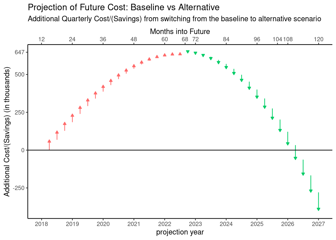
Although the quarterly data doesn’t line up exactly with the critical points, this is due to approximating the data.
Final Verdict
After going through this process, I think the either of the alternatives from iteration 6 would be good choices for the final version of this visualization. I think the quarterly data version is inferior for two reasons. First, now that there are so many points it really looks like a line graph, similar to what I created to show the polynomial fit and it feels “crowded”. Secondly, as I have thought more about the cash flows we’re describing in this visualization, and, more importantly, the consumers of the visualization, I think they might more naturally think of these cash flows as annual.